Summary: Present below is a summary of a session conducted by myself and x-colleague Sachin Gupta for the UrbanCompany Engineering, Product, and Design team in 2020. We highlight the importance of simplicity in product design, the pitfalls of complexity, and how to achieve simplicity. It was a fun and interactive session and in the end we presented practical frameworks and guidelines to create simple products that are successful, and scalable.
Occam’s Razor

Before you dive in, take a moment to look at the image above and try to guess the logic behind the sequence.
- Many with an engineering background quickly identify it as a geometric progression. That’s correct.
- Others might say it’s a sequence of powers of 2. That is also correct.
- Some might even suggest it’s a series of numbers in increasing order. That is also correct.
However, given the information at hand, are these the simplest possible explanations? Could a layman have offered a simpler answer? Why can’t it just be a sequence of positive numbers?
This is where Occam’s Razor comes into play.

It’s problem-solving principle stating that, when faced with competing hypotheses that lead to the same prediction, the one with the fewest assumptions should be selected. In simpler terms, the most straightforward explanation is often the best one.
Unfortunately, people sometimes fall prey to complexity bias, the tendency to prefer more complicated solutions or explanations over simpler ones. This can be especially true in high-stakes situations where individuals want to sound intelligent or demonstrate their expertise.
However, it’s important to remember that human nature is not inherently complex. Embracing simplicity and Occam’s Razor can help us avoid overcomplicating our thinking and lead us to more effective solutions.
The Fine Line: Simplistic vs. Complex vs. Simple
Being simple is often misunderstood as being simplistic, and to avoid this misperception, people sometimes go to the other extreme by adopting complexity. In many cases, individuals give complex explanations for phenomena they don’t fully understand or to adapt to new situations.
Take modern mobile Chatting tools as an example.
- Google Talk was a popular chat tool until around 2010-11 and later launched on mobile, but it didn’t catch on. One reason it failed was the complicated interface that worked on desktop but not mobile. Also, people needed a Gmail address to use chat on mobile, which wasn’t intuitive.
- On the other hand, WhatsApp was native to mobile devices and required only a mobile number to start chatting with friends and family. Whatsapp worked beautifully because it was so simple.
- Another app, called Yo, took simplicity a step further – users could only send the text “Yo” to their contacts (raised 1.5 million dollars too). It became a viral hit but soon fizzled out, as it was too simplistic.
History of product development has many such examples from bicycles to digital cameras to music streaming and so on. Striking the right balance between simplicity and complexity is crucial. But, getting that right balance is not easy.
Bicycles Evolved from Complex to Simple
The evolution of bicycles demonstrates how striking the right balance between simplicity and complexity can lead to more user-friendly and practical solutions.

Early bicycles, such as the Penny Farthing, featured a large front wheel and a small rear wheel, making them difficult to mount & dismount, and posing safety risks. As a response, modern bicycles like hybrid or road bikes have emerged, with ergonomic designs, intuitive gear systems, and efficient brakes that cater to a wide range of users.
However, modern bicycles still typically have a seating capacity limited, which does not accommodate group travel. To address this, some companies introduced bicycles with seating for four people. Such bicycles didn’t gain widespread popularity due to challenges like increased weight, decreased maneuverability, and the need for synchronized pedaling among passengers.

These designs were simplistic solutions that didn’t address the practical needs of most riders.
Music Streaming Evolved from Complex to Simple
In the early days of digital music, people turned to services like Napster and LimeWire, which were clunky, complex, and illegal. These platforms were difficult to navigate and offered a poor user experience.

Spotify emerged as a game-changer, simplifying music streaming and discovery with its vast library, personalized recommendations, and accessible interface. However, Spotify does have its limitations. For instance, users may find it challenging to discover new music amid the platform’s extensive library.

One solution to above was NoonPacific, an app that provided users with a handpicked mixtape of 10 songs each week. While it made discovering new music more straightforward, it sacrificed variety and personalization, ultimately failing to scale.
It was a simplistic solution that didn’t address practical needs of most listeners.
Simple Is Hard
Achieving simplicity is no easy task. It takes a relentless pursuit to deeply understand the problem, create solutions users will appreciate, and foster adoption within the industry and social norms.
Here’s a fun fact: humans managed to land on the moon before figuring out how to put wheels on suitcases. Integrating wheels into suitcase design took over 5,000 years after the wheel’s invention, even though it seems like such an obvious solution.
Brief history of the wheeled suitcase:
- In 1970, Bernard D. Sadow introduced suitcase on wheels, attached to a long strap.
- Wheeled suitcases didn’t become popular for 17 years due to resistance from gendered norms, industry stalwarts, and design flaws.
- In 1987, Robert Plath updated the design by adding two wheels and a retractable handle, and placing the suitcase vertically. This design became widely accepted over time.
Put simply, simple is hard. Even when you identify simple solutions, it takes courage, determination, persistence, and ingenuity to overcome obstacles and transform a simple idea into a scalable and successful product.
PS: Watch The Playlist to learn about Spotify’s challenges in launching and scaling the platform.
Simple User Centric Design Scales

What makes a solution simple and scalable? What factors enable user-centric solutions to achieve mass adoption through the power of simplicity?
Take, for example, the evolution of search engines. Compared to other search engines like Yahoo and AltaVista, Google’s clean and minimalistic interface, coupled with its fast and accurate search results, made it the go-to choice for users even though it was like the 10th or the 15th search engine to launch.

Another example could be Amazon Prime and Flipkart’s subscriber program, SuperCoins. Amazon Prime offers a straightforward model with clear benefits like free delivery and free music. Flipkart’s SuperCoins program has a more complex structure, where users earn coins through purchases and redeem them for various benefits. However, this additional layer of complexity may deter some users from fully engaging with the program.
Both examples show how clear communication and fast delivery of benefits to user can lead to successful products.
Users appreciate simple designs and solutions that just work. After all, people tend to be lazy and prefer products and services that make their lives easier by hiding complexities. But is simple always simple?
Unraveling the Paradox: Simple Is Not Simple
Unraveling the paradox of simplicity is no easy task.
It takes years of learning, iterating, and refining our mental models to master the art of simple thinking. Consider some of the most widely used products
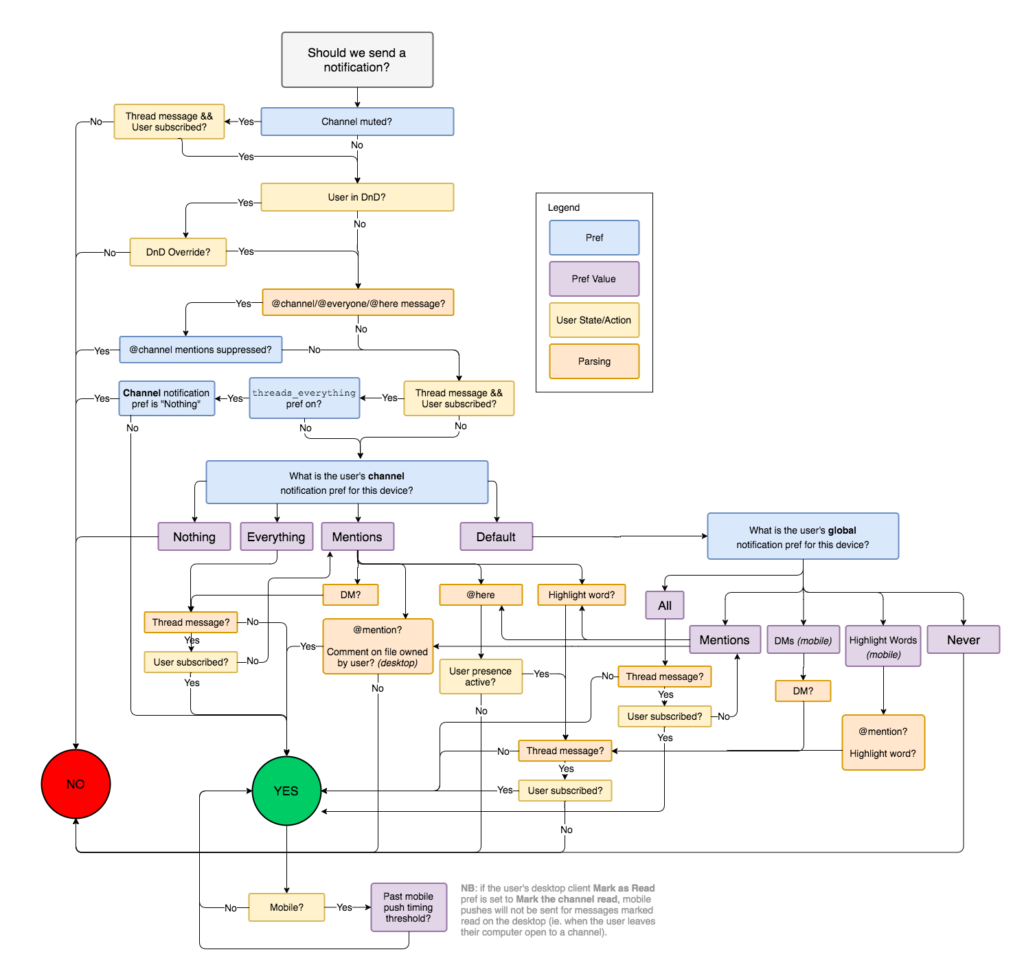
- The backend engineering required to deliver Slack notifications is incredibly complex. However, for the end user, the process is seamless, allowing them to focus on their work on any device without worrying about the underlying intricacies.
- WhatsApp’s engineering enables billions of users to send hundreds of billions of messages and images to each other. The complexity of the system is well hidden from users, making their experience simple and enjoyable.
Embracing simplicity requires perseverance and a willingness to dig deep into problems and overcome perceptions.

When you start looking at a problem and it seems really simple with all these simple solutions, you don’t really understand the complexity of the problem….Then you get into the problem, and you see it’s really complicated. And you come up with all these convoluted solutions….That’s…where most people stop….But the really great person will keep going and find the key….The underlying principle of the problem. And come up with a beautiful elegant solution that works.
— Steve Jobs
The journey to simplicity is often paved with complexities, time taking, requires dedication, and an unwavering commitment to understanding the core principles of a problem.
The Complexity Conundrum: What Causes It?
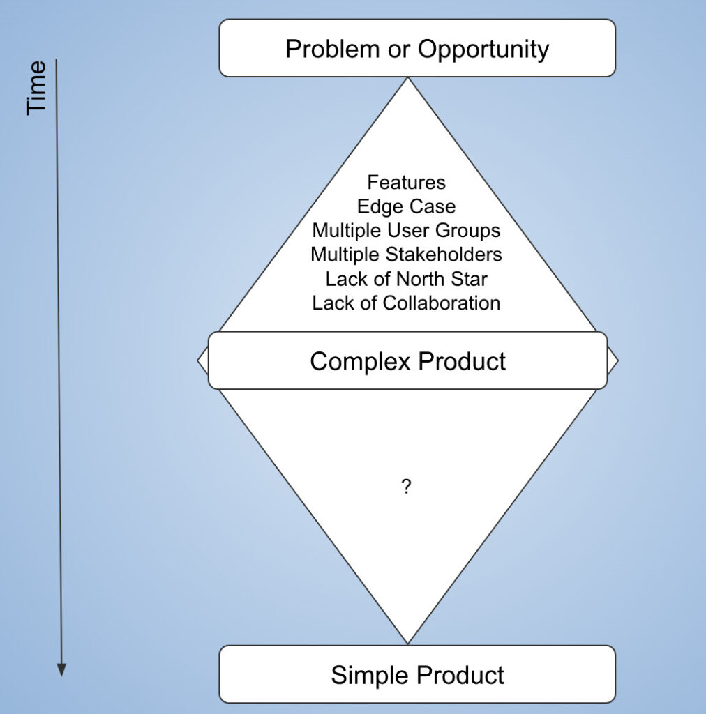
Even with a clear understanding that simplicity leads to success, complexity can still find its way into our solutions. But why does this happen?
When we encounter a problem, our minds naturally gravitate towards devising solutions even as we juggle countless unknowns. A multitude of factors can drive complexity in product design.
- If a product’s goals are not clearly defined, it can lead to feature creep and unnecessary additions that complicate the final product.
- Incorrect problem framing can result in convoluted solutions, while forcing user conformity leads to complex and unintuitive interfaces.
- We often add too many features, thinking it will help users, but it just makes things more confusing and complex.
- It’s essential to address edge cases, but obsessing over every single one can create unnecessary complications.
- Trying to create a one-size-fits-all solution may result in a product that’s cumbersome and hard to navigate.
- Ineffective communication and collaboration within a team can result in misunderstandings, misaligned priorities, and disjointed solutions.
- Being socially tone-deaf or failing to consider the cultural context and user diversity can also contribute to complexity.
As a result, we move focus from the core problem and prioritize half baked assumptions at every stage of the process. The end result is a complex product that doesn’t achieve the desired goals.
How To Keep It Simple?
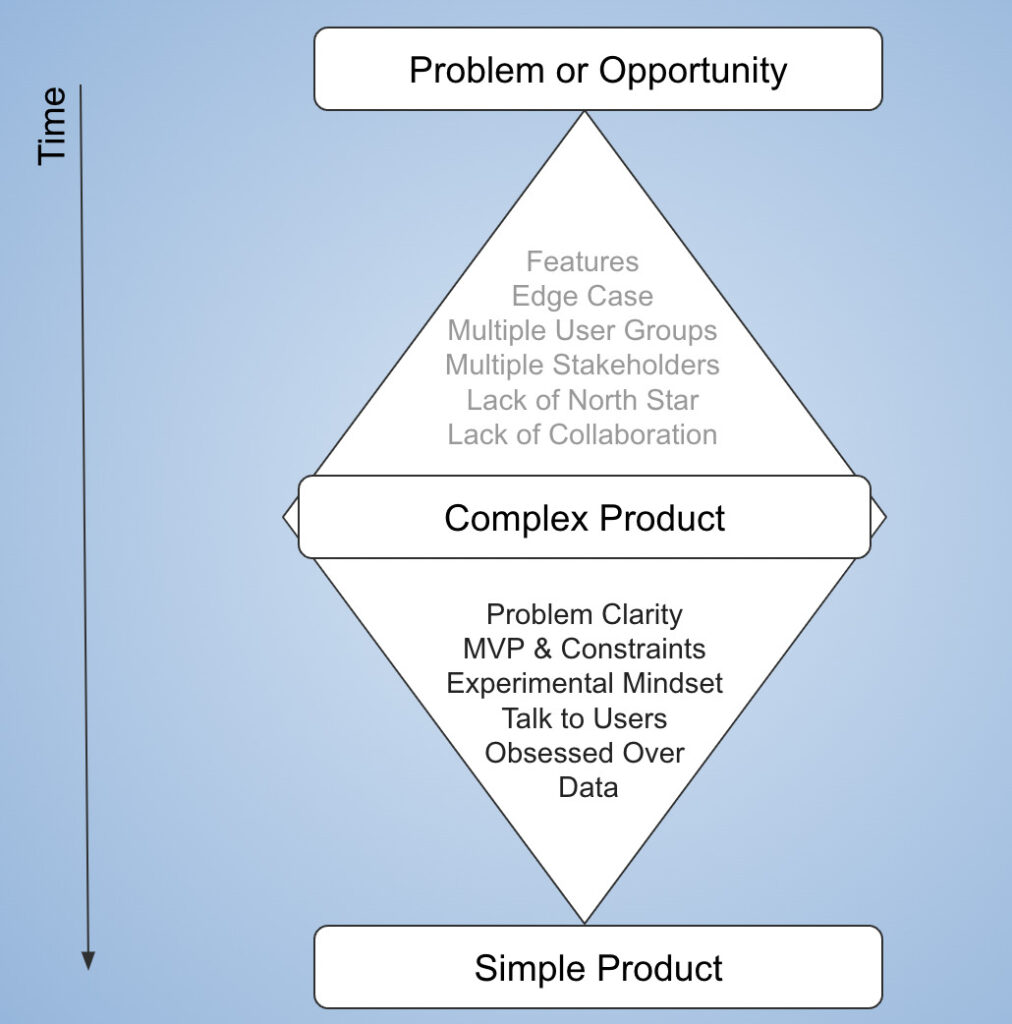
We all get stuck, overwhelmed by the complexity of problems. Below mental models and strategies that can help us navigate these challenges and keep things simple.
Problem Clarity
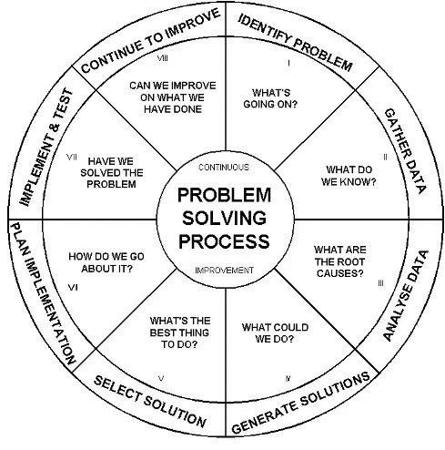
Be paranoid about getting the problem right: Use frameworks like the “5 Whys” to dig deeper into the issue. Obsess over data and truly understand the user. Talk to them, observe their behavior, and comprehend their needs and wants.
Adopt An Experimental Mindset
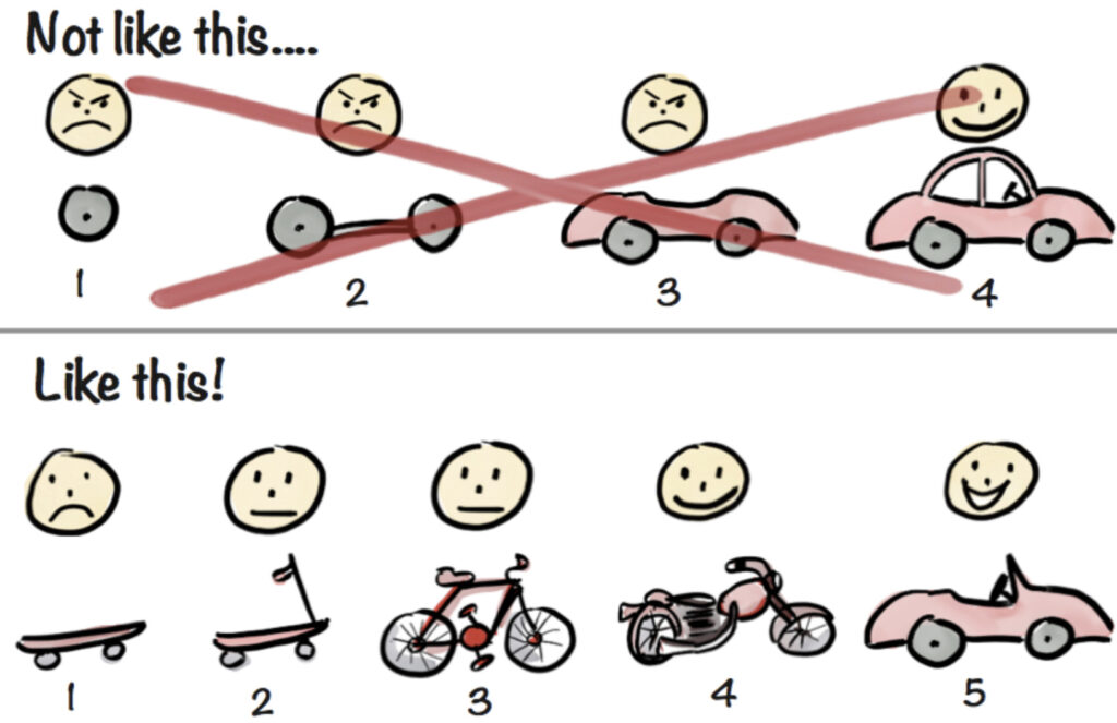
Quickly launch and test your assumptions using approaches like the Minimum Viable Product (MVP) and Occam’s Razor. This will help you stay agile and iterate based on real-world feedback.
Avoid Featuritis
Assess the real need for features through real-world validation, prototype testing, customer shadowing and other practices. This will help you avoid adding unnecessary features based on assumptions rather than actual user needs.
Make Peace With Constraints

Embrace constraints (time based, cost based and so on) as they force you to prioritize and make tough decisions. As Parkinson’s Law states, “Work expands so as to fill the time available for its completion.” Constraints help you stay focused and efficient.
Think In Trade-offs
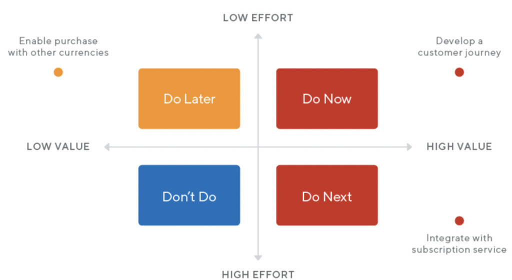
To prioritize features, use a 2×2 matrix like the Eisenhower Matrix. This method categorizes tasks based on trade-offs, allowing you to allocate resources effectively and make informed decisions.
For example, you could evaluate features based on urgency vs importance, or on “user impact vs. development effort” or “frequency of use vs. complexity.”
Choose the right axes for your specific context to focus on the most critical aspects and ensure a simple, user-centric product.
Anti Product Roadmap
Perfection is achieved, not when there is nothing more to add, but when there is nothing left to take away.
Antoine de Saint-Exupéry
Consider implementing an “anti-product roadmap” that removes features with low adoption rates. Challenge the idea of keeping features just because they’ve always been there. Make unused feature removal a regular part of your product roadmap.
Break Down Complex Problems
Break complex problems into smaller, more manageable parts using the Pareto principle(80/20 rule). Simplify complexity by dividing it into smaller tasks. Product management is the art and science of creating simple solutions to complex problems by breaking them down into smaller ones.
If Problem Can’t Be Simplified, Simplify The Implementation
When you can’t simplify a complex problem further, then simplify implementations. This can be achieved by understanding the business domain better or applying principles such as modularity, abstraction, and separation of concerns. These design and coding principles help streamline the process, making it more efficient and maintainable.
Simplicity requires a thoughtful and disciplined approach. Embrace these strategies to streamline your problem-solving process and create more effective, user-friendly solutions. As Albert Einstein once said, “Everything should be made as simple as possible, but not simpler.”
Concluding Remarks
In conclusion, remember that achieving simplicity is no easy feat. It requires dedication, perseverance, and a relentless focus on understanding and addressing user needs. Simple solutions may seem elusive, but they’re worth striving for, as they offer the most satisfying user experience.
Keep in mind that the best products don’t necessarily “wow” users, but rather evoke a sense of “of course”.* This reaction signifies that the solution feels so natural and intuitive that users can’t imagine it any other way.
Feel free to share your thoughts or suggest new ideas by contacting me here or leaving a comment below. Also, the co-author for this blog is ChatGPT.


